This article was updated 04/25/2026
If we told you there was a distinct similarity between Twitter and the rock band Tool, would you believe us?
While it might seem kind of far-fetched, it'’s true! Both have used the Golden Ratio in design in one way or another, often employing the golden ratio formula to achieve harmonious proportions. The latest incarnation of Twitter'’s iconic blue bird logo used circles based on the Golden Ratio, while Tool took a slightly different approach — they structured the song'’s rhythms and time signatures ****using the Fibonacci sequence, which is closely tied to the Golden Ratio.
…Woah, right?

The Golden Rules of Design
What is the Golden Ratio?
The Golden Ratio, often represented by the Greek letter phi (ϕ), has been used in art for a long time and has been known by many different names — The Golden Number, The Divine Proportion, or Phi ( ϕ pronounced like the “fi” in wi-fi).

Whichever way you want to call it, the first known mention of the Golden Ratio was around 300 BC, recognized by early Greek mathematicians like Euclid and Pythagoras. It'’s a proportion, or mathematical ratio, that equals approximately 1.6180, or somewhere around that ballpark. We'd love to give you the exact number, but then you'd never finish this article.
No, seriously.
It quite literally never ends. 1.618033988749895… and so on, until infinity and beyond. For the math whizzes, it’s what is referred to as an Irrational Number (like pi or π, for example).
And according to the ancient Greeks, this Golden Ratio, or Phi (ϕ), as it was originally called, provided the most aesthetically pleasing proportion to the sides on a rectangle. The most notable example of the Golden Ratio being used in their time is the Parthenon, commissioned by Pericles, which was likely to have inspired other Greek architects to design buildings using the same or a similar rigid system of ratios.
However, it wasn’t until 1509 that Luca Pacioli, with illustrations by Leonardo da Vinci, popularized the concept as the “Golden Ratio”, with drawings you have undoubtedly seen across a spectrum of media.

The method of “mathness” Different Shapes Using the Golden Rule
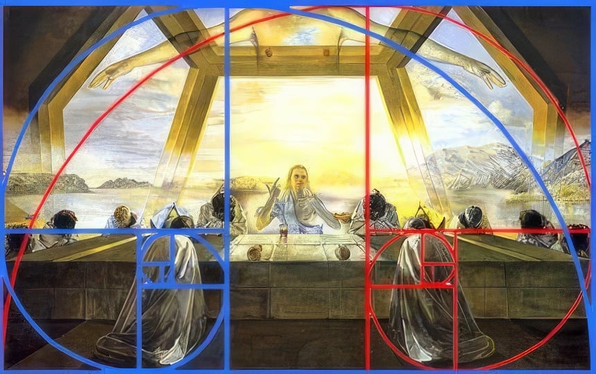
From ancient Greek architecture to the modern logos of major corporations, the Golden Ratio has been used by artists and designers to create visually appealing compositions. For example, Salvador Dali, one of the most famous artists of the 20th century, incorporated the Golden Ratio into some of his most famous pieces, such as "The Sacrament of the Last Supper" and "The Madonna of Port Lligat".
And now you may be saying, “That’s cool. But how did they actually make use of a mathematical formula, often referred to as the golden section, for art?"
We’ll explain. But first, we need to take a look at which elements of the golden ratio artists and designers use.
If math makes your head spin, don’t worry. We’re not about to bog you down with intricate numbers. We’re going to keep this pretty high level and not get lost in math sauce, so to speak.

The Golden Ratio Rectangle
It’s easiest to start by explaining golden rectangles first.
Simply put, it’s a rectangle whose length and width are in proportion to the Golden Ratio. The easiest way to achieve one is by making a rectangle that’s 1618 pixels wide by 1000 pixels high — hence, a golden ratio of 1.618 on one side of the rectangle to 1.0 on the other.
Got your rectangle? Cool. Now let’s get to the magic.
Now, if you were to add a square to one side of the rectangle, the remaining space would still be a Golden Rectangle — exactly a ratio of 1.618.
And no matter how often you cut squares out of it, you'll still have a Golden Rectangle every time. You can do this forever, and you’ll still end up with a golden rectangle every time. Neat, huh?
This is probably the most-used element across the board. It can be used as a grid to place objects, create a balanced layout, establish spacing and proportion, and so on.

The Golden Ratio Spiral (The Fibonacci Sequence)
You may have already heard of this in some movie or another, like “The Da Vinci Code”.
The Fibonacci Sequence is a sequence of numbers where each number is the sum of the two numbers that came before it.
So, you’d start with 0 + 1 = 1. Then 1 + 1 = 2. Then 1 + 2 = 3.
And so on, until you have a string of numbers that looks like 0, 1, 1, 2, 3, 5, 8, 13, 21, 34.
If all the numbers are making your eyes glaze over, don’t worry.
The takeaway is that when these numbers are used to create squares with curves in them, you end up with the Golden Spiral. The Golden Spiral can also be derived from a golden triangle, an isosceles triangle, where the ratio of the longer side to the shorter side is the Golden Ratio.
Artists and designers use this spiral to create a sense of movement and flow in their work and as a means of guiding the viewer's eye through the composition. And interestingly enough, this spiral appears in nature all around us. From how leaves grow on a stem to shells or even a spiral galaxy, it’s seemingly everywhere.

The Golden Ratio Circles
Golden circles are the easiest of the bunch to explain, but they can be a bit tricky to use.
But to form Golden Circles, you have to draw circles within each of the squares of a Golden Rectangle. This will give you circles that are all perfectly proportioned with a ratio of 1.618:1 to the adjacent circle.
And that's it! There's a variety of things you can do with these, but we'll get more into the application later.

The Golden Ratio in Nature
The Golden Ratio can be observed all around us, especially in the plant world where it contributes to both beauty and efficiency. Nature follows the Fibonacci Sequence, which is the foundation of the Golden Ratio. In plants, this sequence governs phyllotaxis, the way leaves are arranged around a stem in a visually pleasing manner. This natural arrangement optimizes space and sunlight exposure, allowing each leaf to bask in the sun without overshadowing its neighbors.
The mesmerizing spiral patterns on sunflower heads showcase this mathematical wonder. The Golden Ratio ensures that each seed is perfectly placed, resulting in an aesthetically pleasing spiral that maximizes seed density and packing efficiency. Other botanical wonders like pineapples, pinecones and various geometric marvels also exemplify this concept. However, the influence of the Golden Ratio extends beyond just plant life.
This divine proportion is evident in human anatomy as well as in nautilus shell spirals and symmetrical limbs of starfish. It is present in our facial features too, illustrating nature's affinity for this timeless design. From seashell spirals to human proportions, the Golden Ratio unites all living beings.
How often is the Golden Ratio in Design Used?
With all these formulas, ratios, shapes, and rules, you may be asking yourself: do artists and designers really use all of this? Isn’t this kind of unnecessary?
And, well, you couldn’t be faulted for thinking that.
Graphic design, art, and creative expression as a whole have never been about adhering to strict mathematical commandments, especially since much of art and expression is personal and subjective. Not to mention, you could follow all the rules of the golden ratio and still come up with something poor. so ultimately, no, it’s not inherently more important than any other ratio — golden or not!
So now you may be asking yourself, “Then is the Golden Ratio just a bunch of baloney?”

The short answer is no!
Even though the vast majority of artists and designers won’t make conscious use of the Golden Ratio, that doesn’t discount the valuable themes it presents within itself. After all, it’s been around for thousands of years for a reason!
Useful ways to use the Golden Ratio
As with any other principle, rule, or ratio in art and design, the Golden Ratio is best used to inform your decisions rather than a strict set of rules that must always be followed.
There are a plethora of valuable principles present within the Golden Ratio, and they can be an excellent means of adding harmonious proportions to any given project. For example, the intentional use of Layout, Positive and Negative Spacing, Hierarchy, Movement, Proportion, and Composition are indeed fundamental to a fantastic piece of art or design.
So while it may be underutilized nowadays, the Golden Ratio can still be used as a powerful tool for creating. But that’s enough of talking about the philosophy and theory behind it… let’s get down to it!
Design Layout Using The Golden Ratio
When it comes to art and graphic design, choosing the right canvas size and layout can make all the difference in creating a composition that is visually appealing and well-balanced. So much like Dali chose a canvas with a 1.618 ratio for his painting, you can do the same with any project you’re working on.

By adding a square on either side of your canvas, you can create a dynamic, two-column layout that can be used in a variety of design projects, from book layouts to web pages to photo collages. Using the Golden Ratio as a guide can help you achieve an asymmetrical balance that emphasizes the hierarchy of the elements within your design. This means that the most important elements will naturally draw the viewer's eye first, making for a more effective and engaging design experience.
Whether for a book, a page on the web, or creating a collage of photos, using the golden ratio will give you a foundation to begin building your elements.
Spacing
Spacing is crucial in graphic design and can make or break a piece. Designs that are too cluttered are overwhelming and chaotic — and very easy to ignore (think cluttered magazine ads).

And a design that is too sparse can appear bland and uninteresting… so striking the right balance is key. However, figuring out where to place objects can be a challenge, especially for beginners.
The Golden Ratio can be an excellent starting point, as it provides a guideline for where objects should be placed for optimal balance and visual appeal. By adhering to the Golden Ratio, artists and designers can create grids and frames of reference without having to rely solely on their intuition.

Golden Ratio Applied to Images
Photography and imagery are some of the most powerful tools in a graphic designer's arsenal. As the saying goes, “A picture is worth a thousand words,” so it’s essential to know how to frame your images correctly.
By using the Golden Ratio, you can first start by creating a grid that is divided into thirds both horizontally and vertically. This type of grid utilizes the Golden Ratio, where the widths and heights of the sections are either 1 or 0.618. Afterward, you can use the intersections to highlight areas of interest.

Of course, you could also just use the rule of thirds, which is much easier to apply. Instead, all squares are of equal height and width. It’s not exactly the same as using the Golden Ratio. but it’s close enough.
But wait, there’s more!
There are also a couple of different approaches you can take. One could consider the overall aspect ratio of the image itself. For example, you might choose to crop an image to have a 1:1.618 ratio, which adheres to the Golden Ratio.
Another way would be to use the Golden Spiral. This spiral follows the pattern of the Golden Ratio and can be used to draw the viewer's eye to specific points in the image. By placing important elements of the image along the path of the spiral, you can create a sense of movement and flow that guides the viewer's gaze in a natural and aesthetically pleasing way.
Golden Circles… remember me?
Remember when we mentioned the Twitter bird being created with the Golden Ratio? Well, more specifically, it was created by using Golden Circles.

Designing logos is all about balancing design elements that will speak to your audience. While all of the circles aren’t perfectly precise, it’s easy to see the intention. Remember, as we said before, these rules don’t exist to be the end-all, be-all. There’s a time to follow rules and a time to break them!
One great way to use Golden Circles is by overlapping two or more of them and then extrapolating new shapes that are created from within. Doing so will allow you to create geometric objects that will look clean and in perfect (or golden) proportion. They can also be used to create interesting patterns and textures, too.
And of course, you don’t have to limit yourself to using this technique to circles. You could really apply it in any shape, so get creative!

Golden Ratio in Web Design (Reference, Not a Rule)
The Golden Ratio isn’t a hard-fast rule for web design—it’s a quick “does this feel balanced?” gut-check when a layout looks off but you can’t explain why.
It won’t fix bad UX on its own, but it can reveal problems fast: awkward spacing, muddy hierarchy, or proportions that feel careless. For us, that sense of balance has becomes muscle memory but the Golden Ratio is a solid training wheel for newer designers who want a concrete way to think about layout.
One caveat: responsive sites make it tough to hold perfect Golden Ratio proportions across every screen size. The practical move is to use it as a starting grid and align key elements to it, so you get the benefits on styling without forcing the math everywhere.
For our agency, design is at the heart of everything we do. We focus on balance and consistency so every landing page feels welcoming, intuitive, and built on the fundamentals of great design and user experience.

Full Circle in Golden Glory
In addition to fundamentals like contrast, color, and typography, the Golden Ratio has a rich history and it can be a great tool when the project calls for it. I even played with it while writing this, applying it to a few older designs and catching things I’d glossed over. Sometimes revisiting the basics with a little applied theory gives you fresh eyes.
Ultimately, the best designs communicate clearly and feel effortless to navigate.
If you’re struggling to create design that looks great and works hard for your business, reach out to Mighty Fine Co. We build functional, on-brand assets that are as effective as they are beautiful. No need to thank us—it’s our job, and we love it.
FAQ: The Golden Ratio in Design
What is the Golden Ratio in simple terms?
The Golden Ratio is a mathematical proportion of about 1.618 to 1. Designers, artists, and architects have used it as a guide for creating layouts, shapes, spacing, and compositions that feel naturally balanced.
Do designers actually use the Golden Ratio?
Some do, but not always in a strict mathematical way. Most experienced designers rely on balance, hierarchy, spacing, and proportion instinctively. The Golden Ratio can be a helpful reference point, especially when a design feels “off” and needs a little visual structure.
Is the Golden Ratio a rule designers have to follow?
Not at all. The Golden Ratio is a tool, not a commandment. A design can follow the Golden Ratio perfectly and still look bad if the message, layout, hierarchy, or user experience is weak. Good design still comes down to clarity, purpose, and execution.
How is the Golden Ratio used in graphic design?
Graphic designers may use the Golden Ratio to create balanced layouts, guide spacing, crop images, build logo shapes, structure typography, or create a visual hierarchy. It can help organize a design so the viewer’s eye moves through the piece more naturally.
How is the Golden Ratio used in web design?
In web design, the Golden Ratio can help with layout proportions, column widths, spacing, image placement, and hierarchy. That said, responsive design makes it difficult to keep perfect Golden Ratio measurements across every screen size, so it works best as a starting point rather than a rigid formula.
Is the Golden Ratio better than the rule of thirds?
Not necessarily. The rule of thirds is easier to apply and works well for photography, layouts, and quick composition decisions. The Golden Ratio is a little more precise and mathematical, but both are just tools for creating balance and visual interest.
Can the Golden Ratio make a logo better?
It can help, especially when building geometric forms or refining proportions. But it will not magically make a logo good. A strong logo also needs to be memorable, scalable, appropriate for the brand, and easy to recognize.
Is the Golden Ratio found in nature?
Yes, patterns related to the Golden Ratio and Fibonacci Sequence appear in many natural forms, including sunflowers, pinecones, shells, leaves, and spiral patterns. That natural connection is one reason the ratio has fascinated artists, designers, and mathematicians for so long.
Should every design use the Golden Ratio?
No. Every design should use good judgment. Sometimes the Golden Ratio is helpful. Sometimes contrast, simplicity, usability, or brand personality matter more. The best designs balance beauty with function, not just math with aesthetics.
Why does the Golden Ratio matter in design?
The Golden Ratio matters because it gives designers a way to think about proportion, balance, and visual flow. Even when it is not used literally, the principles behind it can help create designs that feel more intentional, polished, and easy to understand.