

Web design trends have influenced the internet for decades, so let’s cut to the chase—what is significant in 2026?
You could say I’ve been around the block when it comes to knowing web design trends. Since I grew up in the '90s, the internet has been around as long as I’ve been alive. I’ve even been making websites for most of that time, too. Well… so long as you count using Freewebs.com or Geocities to make janky fan sites — rest in peace.

Professionally, I’ve been making websites for around a third of the internet’s lifespan (10+ years). So, as I continue to age closer to becoming a suburban dad spending weekends over a grill, it’s interesting to consider how top web design trends continue to shift.
And change they shall.
The following are my predictions based on the shifts I've seen in the industry lately. This article focuses on the "big picture"—especially since visual gimmicks come and go. You don't need me to tell you: "Minimalism is in!" when it's never really left in the first place.
So, how are the winds of change blowing in the world of web design trends in 2026 and beyond? Let’s breeze right into it!
Laest Web Design Trends of Baseline Necessities for 2026?
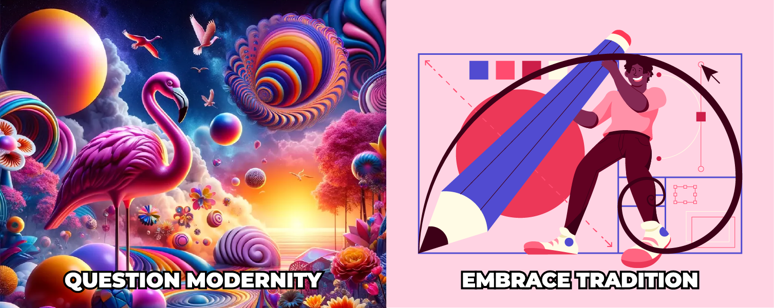
Handmade Graphics: The AI Counter-Movement
Question modernity; embrace tradition!
Joking aside, I think AI is going to push an equally strong trend in the opposite design direction.
When tools like Midjourney and Stable Diffusion can crank out near-perfect visuals on demand, “polished” stops being special. In a world saturated with instant, flawless assets, the websites that truly stand out will be the ones that feel hand-made — intentional, human, and maybe even a little imperfect (in the best way).
That’s not a knock on AI. It’s profoundly useful. But when everything starts looking a little too perfect, people naturally crave the human element again. The quirks. The taste. The details that can’t be templated.
Original, hand-crafted content does more than look cool — it signals that you actually care. It tells visitors, “We invested time here. We didn’t phone this in.” And in a sea of AI sameness, that kind of authenticity becomes the flex.
The New Frontier: LLM Visibility & AI Search
In 2026, people aren’t just “Googling” anymore; they’re asking ChatGPT, Claude, and Perplexity for recommendations. And that’s quickly becoming one of the biggest web design trends of all: designing websites to be understood, summarized, and cited by AI. If your site isn’t visible to Large Language Models (LLMs), you essentially don’t exist for a huge segment of your audience now. Design is all about showing up and being brand positive, so make sure you're being seen by everyone and everything.
This isn’t just an SEO shift—it's a UX shift. The way your content is structured, labeled, and presented now affects whether an AI can confidently pull your answers and recommend your brand.
Ensuring AI Visibility:
- llms.txt: Just like robots.txt, many sites are adopting an llms.txt file in their root directory to give AI crawlers a clear, markdown-formatted map of their most important content.
- Conversational Structure: LLMs love clarity. Using question-based headings (like “What are the best web design trends for 2026?”) followed by a direct, concise answer makes your site easier to quote, easier to trust, and easier to surface.
- Semantic Depth: It’s no longer just about keywords — it’s about entities and credibility. AI looks for “expert” signals: original data, specific case studies, internal linking that builds topical authority, and clear authorship that proves you aren’t just another content farm.
In other words, one of the most important “trends” in web design right now isn’t purely visual—it's building websites that communicate like an expert, both to humans and to the machines increasingly answering on their behalf.

Virtual/Augmented Reality in Web Design
While VR/AR isn’t exactly new in the headlines, what is new in 2026 is how often it’s showing up inside the actual browsing experience—not as a gimmick, but as a legit way to help people make decisions faster, especially on mobile, where most browsing happens now.
You can see it in examples like IKEA Place, which lets you drop furniture into your room with AR so you can sanity-check scale, fit, and vibe before you buy. Or Zenni, where you can “try on” glasses using a photo so you’re not guessing what frames will look like on your face. That’s the real shift: the site stops being a digital brochure and starts acting more like a product experience.
And when your content becomes interactive, your brand becomes something people can engage with, not just scroll past. It’s basically experiential marketing on autopilot—live 24/7—creating a space that feels more like an experience than a hard sell (even though, yeah, that’s still the goal).
I don’t see this trend slowing down. As the tech gets better and as AR/VR features become easier to plug in through third-party tools — we’re going to see more of these integrations everywhere, from big corporate brands down to scrappy startups that want to stand out. Rapid advancements in technology are empowering designers, and it’s a huge win for brands that want more engaging, interactive experiences without paying “custom dev team” prices. A lot of what used to require a small army of coders can now be built with smarter tools, better platforms, and plug-and-play integrations, which means you can deliver high-impact experiences at a fraction of the cost.

Website Builder Trends: No-Code Design
For full transparency: I’m a web designer who’s a big fan of website builders (specifically Divi by Elegant Themes on WordPress), so my opinion may be a little skewed in their favor.
But honestly, there are more website builders out there than ever, and the no-code movement isn’t going anywhere. For me, that’s a win, because it frees up more time to do what I actually love: design. And these tools have come a long way… like, we’re not in the Freewebs/Geocities. Even Squarespace and Wix have advanced more than being glorified template editors.
Now, tools like Divi, Framer, and Webflow feel more like working in Photoshop, Illustrator, or Canva. You can build custom creations from scratch. Developers are still needed for complex functionality, but the grand majority of website needs have been democratized, which minimizes back-and-forth for small tweaks. WordPress has revolutionized online design, and now even “coding” has been democratized too. As an agency designer, we had to lean on dev teams for certain interactions, but ChatGPT and other AI tools have basically become the fastest tech support team on earth, helping us design and build nuanced interactions without hitting a wall every five minutes.
Just to be clear: we’re not talking about templates as the end product. You should never use a template as your finished site—unless you’re a startup and tight on cash. You should always strive to have a website that's 100% unique to your brand.
And looking ahead, I think builders will continue trending as the most convenient hand-off tool for clients. With a rudimentary understanding, clients can make simple changes (headlines, images, etc.) without needing constant back-and-forth—and that’s a net positive.
Mobile-First Design Isn’t a Trend—It's the Baseline
If there’s one “website trend” that isn’t going anywhere, it’s mobile-first thinking. With over 60% of users browsing on mobile, the most important screen your brand will ever live on is the one people carry around all day. And in 2026, mobile-first isn’t about when you design for mobile; it’s about how well you design for mobile.
The shift is simple: treat mobile-first as a philosophy, not a rigid workflow. That means prioritizing performance, clarity, touch-friendly interactions, and context-driven layouts from the first decision—whether you start designing on desktop or not. It also means recognizing that Google’s mobile-first indexing has made the mobile experience the primary experience, both for rankings and real-world visibility.
Get mobile right, and everything else improves: cleaner hierarchy, faster load times, stronger SEO signals, and higher conversions. Not because you followed a trend, but because you designed with intention.
Bolder Visual Experiences and Storytelling in Web Design
For a long time, web design has been a game of constraints. You spend half your life designing around load times and performance, image optimization, caching, CDNs, and all the behind-the-scenes stuff that keeps a site from chugging.
Just think about loading a modern site on a dial-up connection on an ancient PC — yikes! That thing would probably explode.

But as internet connections and hardware keep getting faster, the web’s creative ceiling keeps rising too.
Now, I’m not saying optimization and speed don’t matter — they’re still paramount. I’m saying we have a little more room to play than we used to. And we’re already seeing it: animations are commonplace now, and the tools to create them are built right into modern website builders.
At the same time, users already know what a “good” website is supposed to feel like. Those standards are expected. If your site is slow and looks outdated, it dies out and users bounce.
So instead of chasing one specific aesthetic, the bigger trend is this: web design is leaning harder into immersive experience. The visual style is secondary. What matters is how interacting with the site feels. We’re getting emotional, baby!
Does scrolling evoke wonder? Excitement? Mystery? Does it hype you up for a product? A plain but well-designed site builds confidence, but an immersive and exciting experience can win your audience over.
Apple’s iPhone landing pages are a great example: dynamic imagery, animation, video, interactive 3D moments, micro-interactions… the whole thing feels like you’re scrolling through a motion graphic. The design starts to feel invisible and more immersive.
Not long ago, that level of immersion was unrealistic without a bigger team. Now, the tools are more accessible than ever, especially as website builders keep advancing. You’ll always need a strong designer to do it well, but the gap between “basic site” and “immersive experience” is shrinking fast.

Website Animation Is the Future
Without a shadow of a doubt, we’re going to see way more website animation in 2026. Complex button behaviors, smoother page transitions, smarter hover states, and on-page motion that makes sites feel alive. But designers still need to exercise caution. Speed is still paramount, and animation should never get in the way of the real goal: giving users what they’re looking for as quickly as possible. If motion is lengthy, excessive, obnoxious, or unnecessary, it stops being “fun” and starts feeling like friction.
The sweet spot is micro-interactions: subtle feedback responses triggered by user actions that make a site feel dynamic without slowing people down. Think hover effects, loading animations, menu and icon motion, scrolling enhancements like parallax or fades, content flips/rotations, and even haptic feedback on mobile. These small details are going to be the MVP because they make the experience feel responsive and satisfying.
We’re also moving into a more interactive web: rotating 3D models, sticky animated buttons that reveal details in modals, and interactive menus that change what you see on screen. Interactivity for its own sake won’t elevate a website, but when it’s measured and purposeful, it adds a layer of fun and engagement without making users work for the info.
Finally, expect more experimental navigation: circular menus, creative patterns, and motion-driven transitions. Done right, it creates surprise and delight and strengthens brand identity. Done wrong, it confuses users. The trend isn’t “get weird,” it’s “be memorable without sacrificing usability.”

Kinetic Typography
Kinetic typography is another web design trend gaining traction. It’s exactly what it sounds like: animated text used to create a more dynamic, engaging experience. When it’s done well, it adds energy and motion to a page, grabs attention fast, and helps highlight what matters most.
It’s especially effective for building drama and emphasis. Animated headlines can guide the eye, establish hierarchy, and make key messages feel bigger than static text ever could.
But like any trend, it needs restraint. The animations have to be smooth, intentional, and secondary to the content—otherwise they become distracting. Getting it right usually takes planning, testing, and iteration.
You’ll see kinetic typography show up in things like animated intro titles, scrolling text moments, and headline treatments that subtly move to reinforce a message. Used strategically, it adds visual interest and makes the site feel more immersive, without stealing the spotlight.
Accessibility and User Experience
In web design, accessibility and user experience go hand in hand — and they’re both paramount. A website that’s easy to use and accessible doesn’t just create a better experience; it ensures inclusivity for everyone, regardless of ability or disability. And as we move toward the future, expectations around this are only getting higher.
Prioritizing accessibility and UX means designing for clarity from the start: clear, concise language, intuitive navigation, and thoughtful accessibility features built into the experience—not added as an afterthought. When a site is easy to understand and easy to move through, it reduces frustration, builds trust, and helps users get what they came for faster.
Often, the biggest wins are the simplest: high-contrast color combinations, readable typography, properly structured headings, descriptive link text, and navigation that makes sense the first time someone lands on the page. These choices improve usability for everyone—and make your site far more welcoming for people who rely on assistive technology.
The bottom line: accessibility isn’t a “nice to have.” It’s a core part of modern web design — and when it’s done well, it makes every website feel more polished, trustworthy, and user-frienly.
Making the Web Work for Everyone: ADA Compliance in 2026
At its heart, ADA compliance is about hospitality. It’s the digital equivalent of making sure your building has a ramp, clear signage, and wide enough doors for everyone to enter. While it’s a smart move for legal risk management, the real value is in ensuring that no one is locked out of your brand’s story.
Practically speaking, an accessible site is one that plays well with assistive technologies—like screen readers, voice controls, and keyboard-only navigation. The best part? In 2026, achieving this isn't the mountain it used to be. Modern AI-powered software, like accessiBe, can do much of the heavy lifting for you by automatically scanning and adjusting your site’s interface in real-time to meet compliance standards.
Accessibility is just that: being accessible and making sure you have every opportunity to convert and be a good online neighbor.
Final Thoughts
Honestly, it’s difficult to say exactly how websites will evolve year after year. Over the last decade or so, there haven't been many major "upsets" in web design. This is due to the timeless nature of good design. Faster internet and more powerful computers have been the key driving forces behind the most significant advances in the recent decade. In that aspect, the evolution has been very predictable: as technology advanced, so did the quality of well-designed websites and interactivity that people want.
The 2020s are the first time that natural trend has been seriously disrupted by a true wildcard: AI. And because its applications are so widespread, it’s tough to predict how far it’ll change the game. My sneaking suspicion is we’ll start moving toward truly “living” websites—where AI can adjust experiences and serve catered content on the fly, based on who’s visiting and what they need. However, graphic designers will remain at the forefront.
My best guess is that a lot of AI’s impact will be “invisible.” Less about flashy visuals and more about what’s happening in the background: personalization, content operations, optimization, and smarter site behavior that will enhance the user experience.
On the more visual side, I think the other major game-changer will continue to be website builders, because they democratize who can create websites by removing more of the technical know-how and tedium from the equation. They also let designers stay in the design lane. Rather than managing multiple roles simultaneously, website builders allow designers to concentrate on a single task and enhance the visual experience.
Either way, as a huge fan of web design, it’s genuinely exciting to see where all of this goes as more disruptive tech enters the picture. Mighty Fine Co. provides trend-conscious web designs for your business. Give us a shout. We’d love to see what we come up with together.

